
Monday, December 30, 2013
Great opportunity in Junior miners
This is not a 3X leveraged chart. This is the inverse of the fall in junior miners. We see an incredible parabola that has got to be reversed soon. This can now be played with JNUG, the 3X daily junior gold miner ETF. Today precies metals are falling again getting us closer to a good entry position.

Close to a top in P/E valuations
I borrowed this chart from Smartmoneytracker.com and added my sloped test of resistance lines. Clearly we are getting close to a top in p/e ratios and most likely a market top.


Friday, December 27, 2013
Quick thougts for next week
TYL is in the zone for increased shorting. This bubble will pop!
A terrific hedge play would be to short basic materials and go long precious metals
Basic materials look like a good short from here and above
Turkey should be monitored from here, starting to look cheap.
A terrific hedge play would be to short basic materials and go long precious metals
Basic materials look like a good short from here and above
Turkey should be monitored from here, starting to look cheap.
Saturday, December 7, 2013
Silver, silver, silver

Since last time I posted DSLVdid exactly what I did not expect it to do. It climbed higher along the trendline. The arrow marks where it was last time I posted and where I recommended a short of DSLV. Anyway it's not a disaster but it has now arguably touched the trendline three times and that should be enough. Am I convinced, no, but I have a large portion of my money on this trade. Another thought is that Bitcoin mania is in full force and when it comes crashing down it might well give a push for monetary metals since the metals are a competing money alternative.
Wednesday, November 20, 2013
Silver tredline still respected

I've read several commentators predicting the immenent fall of gold and silver to new lows but if my system is correct silver shouldn't play around for long at theses levels before it starts to climb again. Another touch of the trendline perhaps and then the inverse ETF should start moving down which means silver moves up.
It would be possible for the above chart to respect the trendline while silver continues to fall in an orderly fashion but I think the odds are better for the reverse to happen sinse touching the trendline usually indicates that a turn is coming.
Tuesday, November 12, 2013

Sunday, November 3, 2013
Support floor for Bonds

I don't usually rely on a supporting floor alone for trades but most leveraged ETFs has a short and along version which makes it easy to view the situation from two sides at the same time.

I played the long side earlier, by shorting it at the top circle area, now we are closing in at the second area. I think the united picture given from the charts is worth a trade here.
Turn in gold

Multiple trend/support lines is not uncommon. Is it time for gold again? I can't say for sure but it looks interesting.
Crise in Natural Gas coming

The latest peak up in KOLD is steep and there is a need to predict a possible turn level. But by following the trend line the turn could be made from an much higher level. I am also cautios of gap ups, usually that means the momentum will continue for a while before turning. So both the trendline and the gap up says that even though KOLD is displaying a sharp peak up it is not ready to turn yet. According to this things will get worse for natural gas before the it gets better.
Another turn in real estate


It's a close call but real estate should be heading up again, reverse ETFs should be hitting resistance and head down. It might already have happened or is close at hand. SRS and DRV are 2X and 3X short real estate ETFs.
Friday, November 1, 2013
Timing the gold stock trades

The power of the megaphone patterns for timing is incredible. Let's have a look at recent action in the leveraged gold miner ETFs DUST and NUGT. I've been using DUST with good success for short trades based on the megaphone pattern.

From the latest peak where resistance was tested it's been a steep ride down. Now let's look at where it turned again by looking at NUGT

Again resistance was tested and the turn was visible ahead of time. So we see that with the help of megaphone patterns turns where visible both on the down and upside!
Monday, October 28, 2013
I just bought me some coffee

Coffee traded through the ETF JO looks ready to turn. Here is the chart seen through my 3X inverted stock chart tool:

That is one wacky chart. It's up 20 X since the bottom, or 2000%. If this was a 3X inverse ETF I would be drewling right now. But it is a straight non leveraged ETF which is not that bad either. I will add to this position on any further declines.
Thursday, October 24, 2013
A blow of top to be remembered
I trade two slighly different but similar patterns, blow off top patterns and megaphone patterns. While the trades based on megaphone patterns have performed well the same can not be said for all trades based on BOT patterns. I've lost moeny on two of them. One of them, TYL, has just kept on going and going.

But unless the whole theory of BOTs is wrong, and I've studied a lot of them, this is now a sure short sell. Hopefully we can get an overshoot today to get a good entry.
Another thougth is if this chart is telling something about the whole market. There are no longer any megaphone patterns on inverse ETFs, there are some candidates on long ETFs. So all visible patterns are for shorting the market.
Monday, October 21, 2013
Nasdaq looks overbought
Altough I like to be purely technical and I do not see a clear signal on the Nasdaq index it does look expensive here. Eric Parnell, one of the few analysts I follow, lists how many asset types has started to deviate from the QE pump trend. But more importantly, the chart looks a bit toppy. That's why I do a small short sale from here:

Erics article:
http://seekingalpha.com/article/1749832-stocks-and-qe-all-things-must-pass

http://seekingalpha.com/article/1749832-stocks-and-qe-all-things-must-pass
Thursday, October 17, 2013
The Real Estate Bull facing resistance
I have a hard time fitting this trendline curve but it looks like DRN is pushing up towards the trendline for a second time.

But exactly at what point is hard to tell. I'll monitor this closely for a short entry above this level.

But exactly at what point is hard to tell. I'll monitor this closely for a short entry above this level.
The leader of the Biotech bubble
I've written about Gilead Sciences (GILD) before. It's one of the stocks I'm both short and in the red. It's one of the three biggest Biotech companies in the world and of them it has the most bubbly chart. It reminds me of one of the leaders of the Dot Com bubble: Microsoft.


Before the top it started to get very jagged. It hade a large number of tops and overshoots (when the chart goes back down and then shoots up over the last top). This is what happened next:

If GILD follows Microsoft it would mean one more big overshoot up and then a big rollercoaster fall down.


Before the top it started to get very jagged. It hade a large number of tops and overshoots (when the chart goes back down and then shoots up over the last top). This is what happened next:

Wednesday, October 16, 2013
Convex megaphone pattern trendline
Does the slope of megaphone patterns matter? I usually trade megaphone patterns with a concave trendline. Here's a convex one. TMW is pushing against the trendline resistance. If this pattern is predictable it is even better than the concave trendline pattern because the convex trendline is a lower trending trendline as opposed to the higher trending concave trendline.
 |
Friday, October 11, 2013
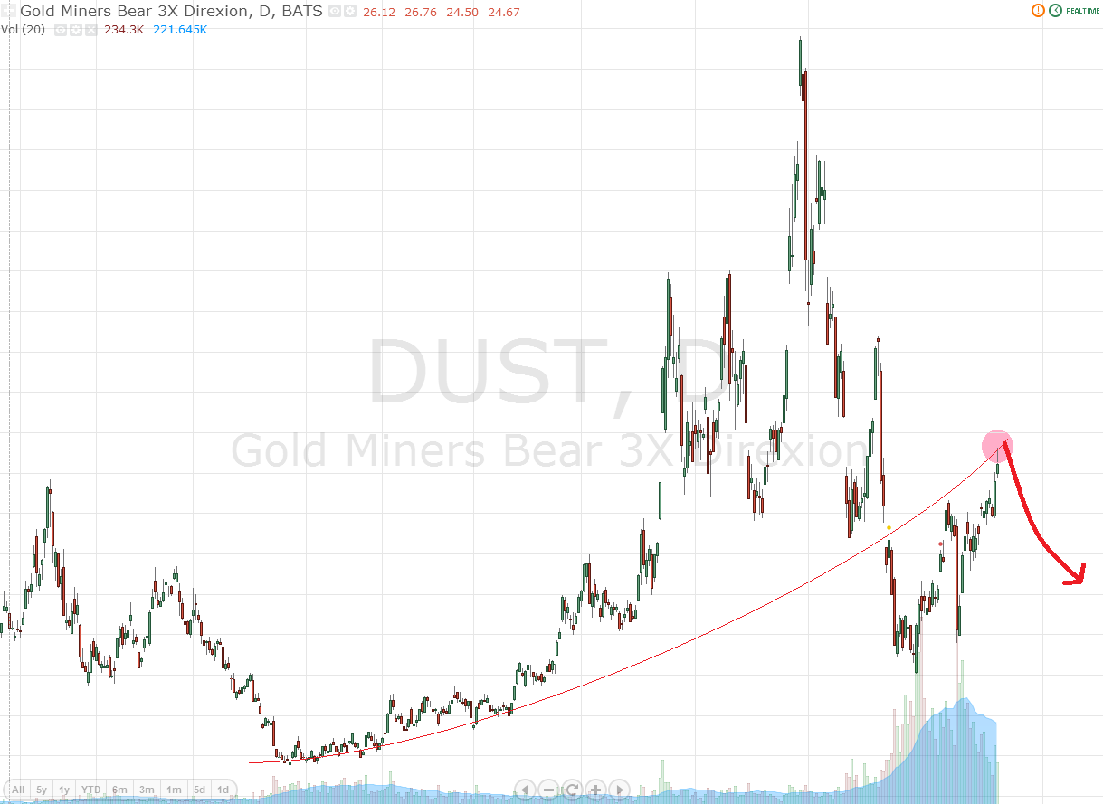
DUST update

It's not always clear where to draw the trendline. Here is the old trendline adjusted slightly upwards. If DUST follows this line then a turn could happen around the 50 level. Patience is needed here before adding to the short position or to NUGT.
Wednesday, October 9, 2013
DUST Update
As I suspected DUST touched the trendline. It is now in the zone for a turn. I'm entering a short sell here. If it moves further up I will add to the short sale and or add position in the opposite ETF: NUGT.
Here was my thought on DUST from September 23, pretty close to what has happened since:

Wednesday, October 2, 2013
Performance September 2.7%
Portfolio performance after all fees paid was 2.7% in september. I am now overweight short positions in the portfolio and most of them have negative return so far. The short positions are in blow off tops and the patterns look solid but when they will break is hard to tell.
Monday, September 23, 2013


DUST Update
After a big down day three trading days ago DUST has had a big climb making it a possibility that we will see a second test of the trendline somewhere around 40.
Saturday, September 21, 2013
My thoughts on QE

I thought I'd do something different and post my thoughts on QE, what it is and how it effects prices of stocks and bonds. It will be a round up of my thoughts after reading up on the subject in the blogosphear and some links where these thoughts are expressed more in detail.
What QE is
What QE is
QE is an
asset swap. Under the current scheme FED gets treasuries and MBS’s (Mortgage backed securites) and in exchange the banking
system gets excess reserves and cash. For banks it means more
liquidity but lower yielding assets. The FED gets added income but added risk.
What QE isn't
QE is not printing money that goes to buying stocks.
Why Quantitative Easing Isn't Printing Money
QE only results in FED reserves and cash, so far about 80% of QE is new reserves, 20% is new cash.
http://www.washingtonsblog.com/2013/06/81-5-of-money-created-through-quantitative-easing-is-sitting-there-gathering-dust-instead-of-helping-the-economy.html
QE will not cause credit expansion because reserves are not used for making new loans
http://pragcap.com/sp-says-repeat-after-me-banks-cannot-and-do-not-lend-out-reserves
Is QE inflationary?
Yes but only marginally. The value of money is determined by the fundamental value (Assets of the FED) plus its liquidity value (The premium over its fundamental value for any asset that is liquid). QE drives out the liquidity value of money and makes its value close to its fundamental value.
For more on understanding fundamental value and liquidity value of assets:
http://jpkoning.blogspot.se/2013/08/google-as-monetary-superpower-parable.html
Do QE cause stocks to rise in price?
Stocks by empirical observation have risen from QE, at least initially. Does QE drive other money to buy
stocks? Before QE the private sector owned more treasuries and MBS’s that yeilded higher
returns than FED reserves. To get the same yeild in total after QE a rebalancing must occur to assets width higher yields when so much assets are locked in low yielding/low risk reserves. This might be one reason more stocks will be demanded.
What effect do QE have on bonds?
By empirical observation QE puts downward pressure on bonds.
http://seekingalpha.com/article/1447181-to-sustain-the-rally-the-fed-should-start-tapering-now
What's a possible explanation? The only one I've seen so far is that QE appart from being mildly inflationary, raises inflation expectations. Then this reaction in the bond market would be irrational. Another reason could be the same as the one for stocks. The private sector wants higher yeilding assets than bonds since they've just been forced to hold plenty of low yielding assets in the form of reserves.
Conclusion
QE is an asset swap, its affect on overall inflation is small and decreasingly effective the more it is done. Its effect on stocks and bonds might be that it drives banks into rebalancing their non reserve assets to higher yielding assets.
Friday, September 20, 2013
EDC
Another possible touching of trendline in a megaphone pattern. Again it's a non reversed pattern. I'm not sure about these. They seem just a little far fetched. Touching the trendline seems to occur a little too often recently but maybe it is just a sign of where we are in the market overall. And I don't think the supprt trendline is symmetrical enough. there is room for it to move up towards 35. I might make a bet if it goes a little further.


DRN
I usually like my megaphone patterns on reversed charts (meaning the megaphone pattern turns up when you reverse the chart from the underlaying market as is done in Bear ETFs) but recently I've traded the megaphone pattern in FXI that is a non reversed chart and now I think DRN looks tempting as a touching of trendline play.


Thursday, September 19, 2013
Tyler Technologies (TYL) Update
I started this blog to follow the blow off top pattern, then I found the more predictable and profitable megaphone pattern. These are the only two patterns I search for. It has been almost only megaphone pattern charts lately so it feels nice to get back to a pretty little blow off chart. So here is an old short recommendation (TYL) steaming ahead above 80. I am short from 73.5

Obviously I was too early. So how about the long term chart?


Obviously I was too early. So how about the long term chart?

Thankfully it shows that TYL is in lala-land. It can go up further but what is encouraging is that it is following the path of an unsustainable move. The short position remains and I hope to see a profit in the not too distant future. It is also likely I will add to the short position if the unsustainable path continues. It is my belief that blow off tops are one of the most predictable patterns, and yet one of the simplest patterns to spot. There is less traders making decisions based on the long term charts then there are traders and investors making decisions based on the increasingly larger stream of incoming fundamental good news. But in stock trading fundamentals don't matter because unless it is fundamentals known by just a few the fundamentals are already priced in.
China (FXI) Update
Despite the big moves everywhere nothings really changed regarding the outlook for FXI. It has now touched the megaphone pattern trendline two times. This should be a very good short candidate from here.


INP and DUST update
I try not to care about macro events and FED decisions etc. I wan't to be purely technical. So I just conclude that for whatever reason a bunch of charts had an interesting day yesterday. In the case of INP it completed a downward move comparable to the last leg up. So what's next? While it's not possible to know the exact shape of the supprting floor for the megaphone pattern of INP it can at least be estimated to be somewhere in either of the two concave lines drawn on the chart below. (The chart is 3X reversed) It's possible that the momentum will push the chart even lower put pretty soon we should see a bounce and a crawl up towards the trendline. I pointed out two possibles scenarios. Both are the same move, it's just a matter of scale. The point is that soon a bounce towards the trendline should be expected. It could be played both on the up move before the trendline is reached and on the downmove after.

Regarding DUST, a bounce towards the trendline is what just happened. But personally I got greedy and wanted to get in at the last minute so except for an initial small position I didn't make much money on this latest move down. I thought the bounce would go just a little bit further up at the 40 level.

After this latest fall in DUST I don't have any read on what DUST is going to do next. The megaphone pattern is finished and I have to greatfull that it was a predictable and profitable pattern. There could be a second attempt towards the trendline but it's nothing I'm going to bet on. If there is a second attemt for the trendline it would be as a new megaphine pattern starts. It's possible that happens, especially considering how big the latest megaphone pattern was. Then DUST is very tradable again, but for not I'm just going to keep my small short position at least for a few days longer and continue to look for megaphone patterns in general.
Tuesday, September 17, 2013
Exiting India ETF and exits in general

The megaphone pattern is a series of increasingly larger spikes, usually set on a concave supporting floor. Now please excuse the artistic quality of the illustration you are about to see.

Once the chart breaks the supporting floor it tends to look for a test of this floor from below, smash in to it and head further down. My preferable way to play the megaphone pattern is to short what looks to be a big spike.
A typical example of this is the post i did August 28. On ordinary stocks and ETFs I search for the megaphone pattern by reversing charts and magnifying the daily movements 3X so the chart mimics the 3X daily leveraged ETFs where the megaphone pattern can be found frequently. So 20 days later the 3X reverse chart of the INP looks like this:

So the question for finding the right exit is where is the chart in relation to the support floor.

Are we here?

Or rather here?
I would argue something close to the latter since the floor line is more concave and symmetric. So there is a high likelyhood the support floor has been broken and the latest spike has almost gone all the way down as it first had spiked up. There is still a high likelyhood that the symmetry of the spike will be completed and that it will move down to the same level as it started before moving up. There is also a high likelyhood that this chart will test the support floor sooner or later. With this in mind we have definetly entered the exiting zone of this ETF. While a few more percents might be made I took the money today and decided to exit INP with a decent profit. But keep in mind there might soon be a second chance to make a trade if there is a test of the support floor coming.
Thursday, September 12, 2013
Thursday Night Update
First of all I had to withdraw 17.6 % of total portfolio value today because of an upcoming apartment purchase. It's not an investment, it's for a place to live.
 |
| (I wish) |
INP has, as predicted, had a strong comeback and might be due for some resistance or even another spike down.
FXI has, as predicted, started to move down.
Wednesday, September 11, 2013
China (FXI) Update

FXI is getting increasingly vertical near the testing of resistance of a previous megaphone pattern floor. I will continue to add to the short position today if the turn doesn't come. Allocation of portfolio will creep up to 25-30%.
DUST Accumulation

Monday, September 9, 2013
The stars and the moon are in line over the Chineese continent

Well maybe not, but the signal I'm seing is that in China (FXI) a megaphone pattern is testing a broken trendline. That usually doesn't end well, so I'm putting some money behind this guess. for now a portfolio allocation of about 20% right away. I'm both short FXI and long FXP. There is not much room for accumulation at this point because the chart seems near the trendline. Maybe the price could still move up a few percent and I might increase the size of the bet but I think it is pretty close to a turn. One thing that makes me a little cautius though is that I usually only see the megaphone pattern in reverse charts, and this is a long chart. But the pattern looks pretty clear so I'm taking my chances with this one but I probably won't hold on to it for long.
 |
| FXI |
Saturday, September 7, 2013
CONN

Subscribe to:
Posts (Atom)